

Comparing Bitcoin Price Cycles
The current 4-year cycle is similar in spite of a very different macro environment

In this article we’ll look at some of the supply demand dynamics of Bitcoin’s previous cycles and how they compare with today.
When you look at Bitcoin’s price history over the past several 4-year halving cycles, the best time to accumulate has generally been in the 2-3 year period after previous halving date. Rather than try and predict an exact price bottom and time larger Bitcoin purchases, another approach is simply to set up smaller regular daily or weekly purchases during what has historically been the low part of each Bitcoin 4-year cycle. This is not financial advice, just an observation from previous cycles.
There are of course many other factors that drive the price, including broader macroeconomic conditions and the amount of money chasing supply based on global liquidity. And in earlier Bitcoin cycles, there was a different backdrop of looser central bank monetary policies, zero/near zero interest rates and lower inflation. In this cycle, we could see a more classic drawn out recession, versus the sharp drop and recovery we saw in early 2020 with a deluge of financial relief propping up Bitcoin and other asset prices. Things are different for Bitcoin this time in macro. And yes, earlier this year the price of Bitcoin fell below the previous cycle high from December 2017. In past cycles that didn’t happen.
But still the supply-demand dynamics in this cycle have in many ways mirrored previous cycles and give us insights into what we might expect leading up to the next halving in April, 2024.
Decreasing New Supply
Before we dive in, let’s talk a little about the basics of Bitcoin supply. New Bitcoin gets added to the network at a predetermined rate that gets reduced by half every 4 years (technically every 210,000 ten-minute blocks). Every 10 minutes, Bitcoin miners are currently awarded 6.25 Bitcoin for successfully mining transactions. Once we reach the next halving date, in April, 2024 the award will be cut in half to 3.125.
This means that the annual increase in new Bitcoin supply will fall from about 1.7% to 0.85%. In previous 4-year halving cycles, the award went from 50 to 25 to 12.5 to 6.25 Bitcoin. The halving cycles will continue until 2140 with the reward tapering out to zero and the total supply of Bitcoin reaching 21 million.

This is a very different type of supply-demand dynamic than you have with a typical commodity. Normally, as the price for a commodity like oil or copper increases, producers will invest more money to increase the supply to take advantage of higher prices. As more supply hits the market, prices naturally come down and the cycle repeats.
But Bitcoin is a digital commodity programmed to be scarce with a rate of supply that is completely independent of the demand and price. As more people use and value the Bitcoin network for saving and transacting, they drive the price up. But there is no increase in the rate of supply in response. Over time the rate of new supply decreases regardless of how high the demand for Bitcoin gets.
Previous Cycles
If you compare the current cycle with previous, in a chart produced by @BitcoinPierre, a few general trends jump out at you:
There’s a steep increase in price after the halving as the market adjusts to less new supply.
The cycle high occurs 12-18 months after the halving date.
The price trends lower starting 12-18 months after the halving (as speculation and leverage peaks) and bottoms somewhere after the 2 year point.
The price recovers as you approach the next halving.

Even more striking is how close the previous cycle lows and highs align in a chart produced by @therationalroot. If the pattern holds this cycle, then the cycle high would occur mid-to-late 2025.

On Chain Metrics
On-chain metrics are also supporting previous patterns. For starters, the amount of Bitcoin that hasn’t moved in over a year seems to be peaking and rolling over, which is an indicator of price bottoms. On the flip side, during market tops you see a lower percentage as more hot money chases and speculates, and longer term holders sell at gains.
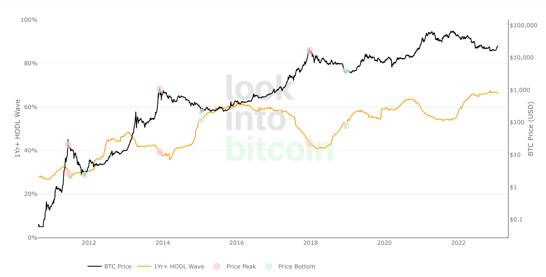
Source: https://www.lookintobitcoin.com/charts/1-year-hodl-wave/
The chart below reinforces this point by showing the amount of Bitcoin in circulation based on different age bands throughout the lows and highs of past cycles.

Source: https://www.lookintobitcoin.com/charts/hodl-waves/
Another important factor is the relationship between the current market value versus the value of the Bitcoin in aggregate the last time it moved which is also indicating a lower point in the cycle.

Source: https://www.lookintobitcoin.com/charts/mvrv-zscore/
There’s of course no guarantees that future price action will continue to reflect previous patterns, but it is clearly something to watch as this cycle unfolds.